Category
Tools
-

How an investigation gave voice to people whose bionic eye implants went obsolete
What happens to users of cutting-edge implants when the only company that makes the technology runs out of money? That’s…

-

Wednesday webinar to explore film shedding light on the youth mental health crisis
During the making of “Hiding in Plain Sight: Documenting the crisis in kids’ mental health,” a then-executive at the National…

-

Journalism organizations that offer training, networking, industry news and more—recommendations from AHCJ members
AHCJ is my favorite journalism association. I have made many friends networking at the annual conferences, found editors through PitchFest,…

-

How to cover the 2021-2022 flu season
As it does every fall, the CDC is urging Americans to get their annual flu shot. Last year, flu was…

-
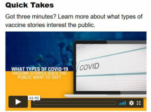
Toolkit offers COVID-19 vaccine story ideas, survey findings on vaccine attitudes
Journalists reporting on the rollout of the COVID-19 vaccine have a new tool to guide their coverage: a Vaccine Education…

-

New resources for covering the virus that’s changed our world
What a year it’s been for health care journalism to shine. On Jan. 5, 2020, the World Health Organization issued…
-

Freshen your skills with online course on reading medical studies
When it comes to feeling competent about understanding, interpreting and reporting on medical studies, one under-appreciated fact is that this…
-
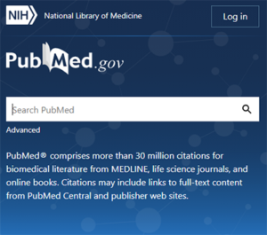
New PubMed search site will continue to evolve
If you’re a frequent user of PubMed, you have likely already noticed the new website layout and have probably noticed…
-
Getting the most from webinars on COVID-19 and the coronavirus
Between social distancing guidelines and the fact that a global pandemic truly does impact the entire world, webinars and online…
-
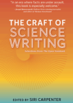
AHCJ freelancers contribute to new book on science writing
Several AHCJ members are part of a new book, “The Craft of Science Writing,” which was published at the beginning…