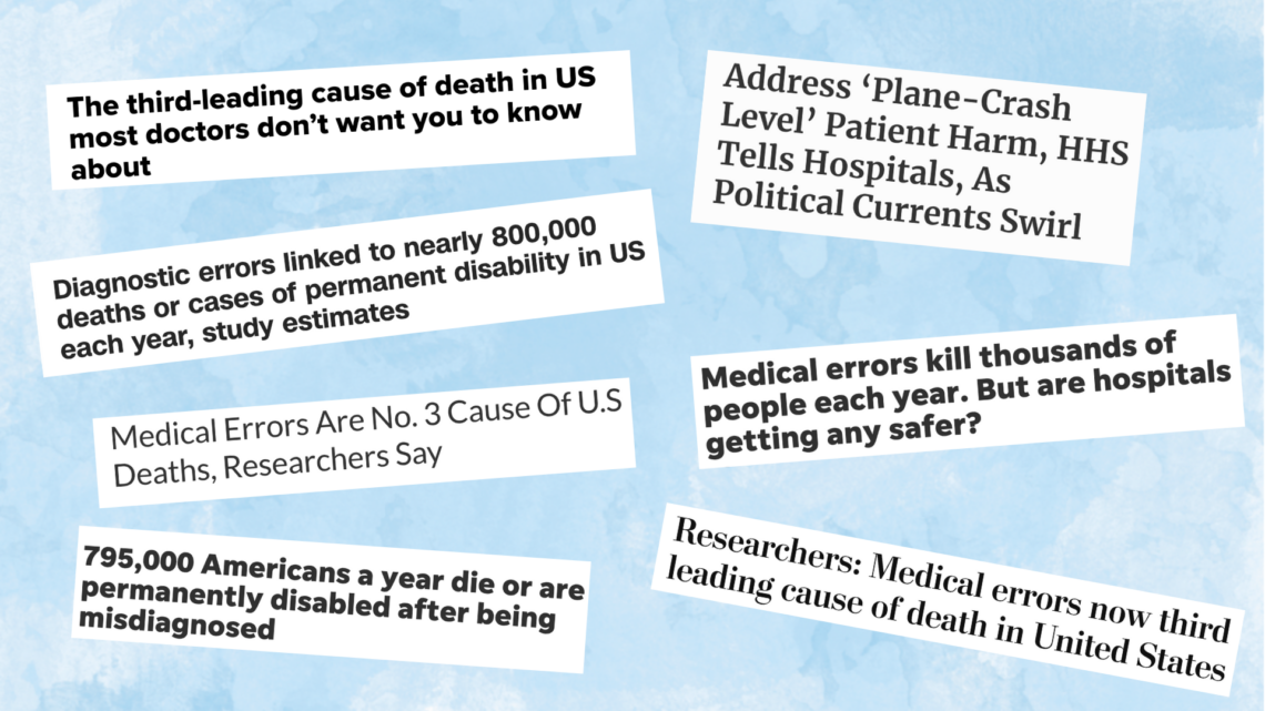
Obesity doctor calls journalists’ statistical knowledge into question
Yoni Freedhoff, M.D., founder of Ottawa’s Bariatric Medical Institute, writes about two studies about obesity and questions whether journalists are skilled enough in statistical analysis to accurately report on them.
Freedhoff says a new report refutes an earlier study – published in the New England Journal of Medicine and widely reported by the media – as being statistically flawed. And he is skeptical the new study will receive attention from the journalists who reported the first study.
The original study, “The Spread of Obesity in a Large Social Network over 32 Years” by Nicholas A. Christakis, M.D., Ph.D., M.P.H., and James H. Fowler, Ph.D., was widely reported with headlines proclaiming that “Obesity is socially contagious” in 2007.
A new study by Indiana University’s Russell Lyons, published in Statistics, Politics, and Policy, claims “the assumptions behind the statistical procedures used were insufficiently examined.”
As Freedhoff notes, the NEJM has an impact factor of 50, while Statistics, Politics, and Policy has an impact factor of 0.857, leading one to wonder how many reporters have even heard of the new study.
But Freedhoff – who admits he’s no statistics expert – questions whether journalists will report on the new study because they do not have the statistical knowledge to do so.
All in all, even if you’re not a statistician, Lyons’ paper is worth a sober read and reflection, and here’s something else to chew on – the journalists who were originally all over Christakis’ and Fowler’s work? I’d bet every last penny I’ve got that not a single one of them were skilled enough in statistical analysis to analyze it. Really, why should they have been? They’re journalists, not statisticians. No, instead they smelled a good story, and ran with it. Those same journalists who shouted from the rooftops that obesity’s contagious? I’m betting the vast majority of them are going to be silent on this one, yet wouldn’t re-reporting be the socially responsible, ethical, and journalistic right thing to do?
Update: Brian Reid found this paper, “Examining Dynamic Social Networks and Human Behavior,” that appears to be a response to Lyon’s research – Christakis and Fowler reference his critique specifically at least twice in the paper.
So, reporters, let’s hear what you think: Do you know enough about statistics to analyze and report on the new study? Or were you even aware of the new study?
It’s certainly worth pointing to AHCJ’s most recent slim guide here: Covering Medical Research, which helps journalists analyze and write about health and medical research studies.
It offers advice on recognizing and reporting the problems, limitations and backstory of a study, as well as publication biases in medical journals and it includes 10 questions you should answer to produce a meaningful and appropriately skeptical report. This guide, supported by the Robert Wood Johnson Foundation, is a road map to help you do a better job of explaining research results for your audience.
An earlier slim guide, “Covering Obesity: A Guide for Reporters,” also might come in handy for covering the topic.
Critics point out issues in patient satisfaction ratings
Filed under: Health data, Hospitals, Hot Health Headline
On the heels of a government proposal to tie hospital incentive payments to patient satisfaction ratings, a few outlets have started looking at the validity of such measurements.
At HealthLeaders Media, Cheryl Clark reports that regional differences in tendency to be satisfied (the numbers show that New Yorkers are harder to please than Midwesterners and New Englanders, for instance) mean that any absolute number thresholds issued by the feds would penalize hospitals in parts of the country where folks are less likely to respond well to surveys.
And on KevinMD.com, William Sullivan, D.O., J.D., takes a few swings of his own, first taking aim at the ratings’ sampling and statistical grounding, then moving on to what he says is hospitals’ over-reliance on percentile quality ratings.
The problem, according to Sullivan? Overall patient satisfaction is quite high, thus doctors’ ratings cluster tightly around the low 90s on a 100-point scale. That means even a small shift in absolute rating will cause a huge jump in percentile. On at least one system, a 4-percentage-point absolute drop will take a doctor from the 90th percentile to the 50th. And, thanks to the aforementioned sampling issues, that drop can be caused by a handful of particularly ornery patients. Patients who, Sullivan writes, are thus given massive leverage.
With our employment and our compensation hinging on every “5” we can get, doctors are being coerced into giving patients whatever they want, regardless of medical appropriateness. When we cater to satisfaction scores more than we cater to proper medical care, we are violating our oath, devaluing our education, and potentially harming our patients.
AHCJ Resource:Analyze patient satisfaction surveys for your local hospitals
“Numbers can be a start - not the end - of a story,” the AHCJ website notes. Remember that patient satisfaction scores only mean so much. Sometimes the best doctors have gruff demeanors while those with inferior skills have great bedside manners. Patients may not recommend hospitals to friends because they dislike the food or think their roommates were too loud. But if patients report that doctors or nurses didn’t communicate well, that very well could affect the care the patients received. Using data can give you a valuable tip sheet to generate ideas and questions in your pursuit of a story.
For hospital overall survey results, AHCJ includes comparison of data first released in March 2008 then updated quarterly, allowing journalists to compare overall survey results over a lengthy timeline.
How numbers can be used to buttress falsehoods
On The New York Times‘ Well blog, Tara Parker-Pope interviewed NYU journalism professor Charles Seife, author of Proofiness: The Dark Arts of Mathematical Deception. While the book’s not exclusively focused on health care, the interview does touch upon numbers and health journalism.
Once you get past all the goofy catchphrases (proofiness! randumbness!), the basic point Siefe makes in the interview, that correlation is not causation, shouldn’t surprise anyone. Nevertheless, I enjoyed his elegant, health-related illustration of the phenomenon:
We are extraordinary pattern-matchers. Anytime there is something that is happening, we try to find a cause. But sometimes in medicine, sometimes things are absolutely random. Our minds don’t accept that. We must find a cause for every effect.
A really good example is the autism issue. Whenever a parent has a child who ends up being autistic, the parent more than likely says, “What caused it? How did it happen? Is there anything I could have done differently?” This is part of the reason why people have been so down on the M.M.R. vaccine, because that seems like a proximate cause. It’s something that usually happened shortly before the autism symptoms appeared. So our minds immediately leap to the fact that the vaccine causes autism, when in fact the evidence is strong that there is no link between the M.M.R. vaccine or any other vaccines and autism.
One caveat: Covering Health is not in the book review business, and I haven’t yet read Proofiness beyond what’s been excerpted.
July 1 marks a big day for health reform
Scott Hensley, on NPR’s Shots blog, has a nice rundown of the health care provisions that go into effect today, including the so-called tanning tax, high-risk insurance pools and the new healthcare.gov website.
For reporters writing about the tanning tax, we remind you to look carefully at the numbers and be sure to accurately report the data behind this policy decision. Much of the reporting we’ve seen cites numbers presented by the World Health Organization: “use of sunbeds before the age of 35 is associated with a 75% increase in the risk of melanoma.” But that statistic represents the relative risk, while the absolute risk – the chance of something happening – is far different. Reuters Health Editor Ivan Oransky, M.D., has written about the subject for Covering Health:
“You can see how if someone is lobbying to ban something – or, in the case of a new drug, trying to show a dramatic effect – they would probably want to use the relative risk.”
For a detailed explanation, be sure to read Oransky’s post about the statistics on tanning.
If you’re reporting on the high-risk insurance pools that go into effect today, don’t miss our tip sheet on the topic, with story tips, suggestions and resources from four experience reporters. Apart from being a policy story, it’s of great interest to all your readers, viewers or listeners who have pre-existing conditions and are struggling to find coverage.
Another tip sheet addresses what needs to be covered now that the Patient Protection and Affordable Care Act has been passed and begins to be implemented.
A recent briefing, “Reporting on health reform between now and 2014,” offers further advice and resources from some top Washington, D.C.-based journalists on implementation deadlines, how to cover local issues, Medicare reimbursement rates, what reporters should look for in their states and more.
Tanning beds: What do the numbers really mean?
This is a guest post from Ivan Oransky, M.D., editor of Reuters Health and AHCJ’s treasurer, has written at my invitation.
May has been declared “Melanoma Awareness Month” or “Skin Cancer Awareness Month“ – depending on which group is pitching you – and reporters are doubtlessly receiving press releases and announcements from a number of groups, including the Melanoma Research Foundation, the Skin Cancer Foundation, hospitals, doctors and other organizations.
Those press releases often point to the World Health Organization, which reports that “use of sunbeds before the age of 35 is associated with a 75% increase in the risk of melanoma” – a statistic often repeated in news stories about tanning beds.
Photo by Whatsername? via Flickr
But what does that really mean? Is it 75 percent greater than an already-high risk, or a tiny one? If you read the FDA’s “Indoor Tanning: The Risks of Ultraviolet Rays,” or a number of other documents from the WHO and skin cancer foundations, you won’t find your actual risk.
That led AHCJ member Hiran Ratnayake to look into the issue in March for The (Wilmington, Del.) News Journal, after Delaware passed laws limiting teens’ access to tanning salons. The 75 percent figure is based on a review of a number of studies, Ratnayake learned. The strongest such study was one that followed more than 100,000 women over eight years.
But as Ratnayake noted, that study “found that less than three-tenths of 1 percent who tanned frequently developed melanoma while less than two-tenths of 1 percent who didn’t tan developed melanoma.” That’s actually about a 55 percent increase, but when the study was pooled with others, the average was a 75 percent increase. In other words, even if the risk of melanoma was 75 percent greater than two-tenths of one percent, rather than 55 percent greater, it would still be far below one percent.
For some perspective on those numbers, Ratnayake interviewed Lisa Schwartz, M.D.,M.S., whose work on statistical problems in studies and media reports is probably familiar to many AHCJ members. “Melanoma is pretty rare and almost all the time, the way to make it look scarier is to present the relative change, the 75 percent increase, rather than to point out that it is still really rare,” Schwartz, a general internist at Veterans Affairs Medical Center in White River Junction, Vt., told him.
In a nutshell, the difference between skin doctors’ point of view and Schwartz’s is the difference between relative risk and absolute risk. Absolute risk just tells you the chance of something happening, while relative risk tells you how that risk compares to another risk, as a ratio. If a risk doubles, for example, that’s a relative risk of 2, or 200 percent. If it halves, it’s .5, or 50 percent. Generally, when you’re dealing with small absolute risks, as we are with melanoma, the relative risk differences will seem much greater than the absolute risk differences. You can see how if someone is lobbying to ban something – or, in the case of a new drug, trying to show a dramatic effect – they would probably want to use the relative risk.
This is not an argument for or against tanning beds. It’s an argument for clear explanations of the data behind policy decisions. For some people, the cosmetic benefits of tanning beds – and the benefit of vitamin D, for which there are, of course, other sources – might be worth a tiny increase in the risk of melanoma. For others, any increased risk of skin cancer is unacceptable. (And of course, for the tanning industry, the benefits can be measured in other ways – dollars.) But if reporters leave things at “a 75 percent increase,” you’re not giving your readers the most important information they need to judge for themselves.
So when you read a study that says something doubles the risk of some terrible disease, ask: Doubles from what to what?
Related
These numbers also might come up in reporting about the health reform bill as it does in “Indoor Tanning Getting Moment in the Sun” (March 26, 2010). From the story:
Over the past decade, indoor tanning has increasingly been likened to other maligned habits, cigarette smoking in particular.
And with the passage of the new health care bill, government officials are prepared to take that comparison one step further. A 10 percent tax could be levied on indoor tanning as early as July, in an effort to offset some of the health care bill’s multi-billion-dollar budget.
AHCJ resources on writing about medical studies:
- Evidence-based medical reporting
- Understanding the scientific article
- Understanding medical publications
- Statistical errors even you can find
- What you need to know about risks, rates and ratios
- Medicine 101: Words, numbers and journals
In addition, look for a slim guide about covering medical studies that AHCJ will publish this summer.
In 2008, fewer preterm babies, more cesareans
Births in the United States went down nearly 2 percent in 2008, according to new figures [PDF] from the CDC’s National Center for Health Statistics.
Among the report’s highlights:
- The birth rate for U.S. teenagers fell 2 percent, reversing a two-year increase.
- The birth rate for Hispanic teenagers declined to an historic low.
- The cesarean delivery rate rose for the 12th straight year, to 32.3 percent of all births.
- The percentage of births born preterm declined 3 percent.
Health Journalism 2010

Learn more about “Pregnancy and childbirth trends: Issues of safety and choice,” a panel featuring Mark R. Chassin, M.D., president of The Joint Commission; Julie Deardorff, health and fitness reporter at the Chicago Tribune; Alan M. Peaceman, M.D., professor of obstetrics and gynecology at Northwestern University’s Feinberg School of Medicine and chief of the Division of Maternal-Fetal Medicine at Northwestern Memorial Hospital; and moderated by Deborah L. Shelton, a Chicago Tribune health reporter.
Duo writes about how health statistics can mislead
Filed under: Europe, Health data, Health journalism, Studies, Tools
Writing in mathematics-focused Plus Magazine, Mike Pearson (bio) and David Spiegelhalter (bio|wikipedia) examine not only the variety of methods used to report health statistics, but also just how each of those methods is employed to mislead physicians, patients and journalists alike. The piece was adapted from their Understanding Uncertainty Web site. The site, which is aimed in part at helping journalists understand statistics and probability, is profiled in this story.
The duo point out and illustrate common pitfalls and summarize relevant research. Not only do they point out fundamentals such as advantages that “number needed to treat,” and to a lesser extent absolute risk (1 in 100,000), numbers have over the popular relative risk (30 percent more likely), they also go much deeper. For example:
One of the most misleading, but rather common, tricks is to use relative risks when talking about the benefits of a treatment, for example to say that “Women taking tamoxifen had about 49% fewer diagnoses of breast cancer”, while potential harms are given in absolute risks: “The annual rate of uterine cancer in the tamoxifen arm was 30 per 10,000 compared to 8 per 10,000 in the placebo arm”. This tends to exaggerate the benefits, minimise the harms, and in any case make it hard to compare them. This way of presenting risk is known as mismatched framing, and was found in a third of studies published in the British Medical Journal.
And mixing and matching numbers isn’t the only way statistics can be misleading; the writers list many. Even the humble denominator can be manipulated.
For example, people have been offered a prize for drawing a red ball from a bag, and then given the choice of two bags: one containing 1 red ball and 9 white balls, the other containing 8 red balls and 92 white balls. The majority chose the bag with 8 red balls, presumably reflecting a view that it gave more opportunities to win, even though the chance of picking a red ball was lower for this bag. Similarly, people confronted with the statement “Cancer kills 2,414 people out of 10,000,” rated cancer as more risky than those told “Cancer kills 24.14 people out of 100″. The potential influence of the size of the numerator and denominator is known as the ratio bias. Frequencies are generally used in risk communication, but it is important to keep a common denominator in all comparisons.
For a thorough primer on statistics and health, the authors highly recommend Helping Doctors and Patients Make Sense of Health Statistics (pdf), an engaging 2008 paper that makes heavy use of examples and anecdotes to illustrate key issues in the interpretation of statistics.
That paper’s authors recommend the following best practices for writing about health statistics:
We recommend using frequency statements instead of single-event probabilities, absolute risks instead of relative risks, mortality rates instead of survival rates, and natural frequencies instead of conditional probabilities.
Also of interest is this related editorial (pdf) in which media are described as “enablers” of statistical illiteracy. The author also points out that, even if journalists communicate risk in the most objective possibly fashion, folks from different cultural backgrounds will still perceive it differently. It includes an interesting side note about the far-reaching impact of how physicians are allowed to define their own legal standard of care.
Related
AHCJ tip sheets
- Statistical errors even you can find
- What you need to know about risks, rates and ratios
- Medicine 101: Words, numbers and journals
AHCJ articles
- Health Journalism 2008: Lies, damned lies and medical statistics - how to interpret the evidence
- Improving reporting on medical studies
- LINK: Finding and Using Health Statistics
Improving reporting on medical studies (#ahcj09)
“It is possible for good health journalists to provide spectacular stories on health,” said David Henry, CEO of the Institute for Clinical Evaluative Sciences.
During the afternoon panel on “Statistics, Conclusions, Limitations: Reporting on Medical Studies” at the annual Association of Health Care Journalists meeting in Seattle both Henry and moderator Gary Schwitzer, concurred that most health and medical reporting is inaccurate, imbalanced and incomplete. “After three years and 750 stories reviewed there is still a ‘kid-in-the-candy-store projection of health’ in most health news,”Schwitzer said shortly before he launched into a dissection of several news stories.
Independent journalist Christy Fricks writes about the panel - links to the speakers’ presenations are included.


